Kitchen Cabinets & Vanities Blog
Kitchen Cabinet Colors: What Do They Say About Your Space?

Your kitchen is the most lived-in room in the house. It’s where mornings begin, where meals get made, where people naturally gather. That’s why cabinet color matters so much: it doesn’t just “look nice,” it sets the emotional temperature of the entire space.
A cabinet color choice signals what you value—calm, warmth, energy, simplicity, boldness—and it changes how big your kitchen feels, how clean it reads, and how cohesive your finishes look together. The best kitchens usually follow a traditional truth: choose a color that fits the home, respects the light, and still feels right years from now.
Below is a clear guide to what popular cabinet colors communicate, plus practical pairing tips so the final result looks intentional, not accidental.

Start Here: What Your Cabinet Color Is Really Communicating
Before we talk specific shades, think of cabinet color as a “message” your kitchen sends:
-
Light colors tend to communicate openness, freshness, and simplicity.
-
Mid-tone neutrals communicate balance, comfort, and a lived-in warmth.
-
Deep colors communicate confidence, depth, and design purpose.
-
Natural wood tones communicate authenticity, warmth, and timeless value.
The trick isn’t choosing the “right” color for the internet. It’s choosing the right color for your space—your lighting, your flooring, your counters, and how your household actually uses the kitchen.
White Cabinets: Clean, Orderly, Bright

White cabinets communicate clarity. They make a kitchen feel airy and structured, and they’re the easiest starting point for most design directions.
Why homeowners choose white
-
Makes small kitchens feel larger
-
Works with nearly any countertop
-
Keeps the space bright, even in lower light
Make white feel warm, not sterile
White becomes a problem only when it’s too stark. If your kitchen feels cold, shift to warmer whites (soft ivory, creamy off-white) and pair them with:
-
warm wood floors
-
brass or champagne bronze hardware
-
warm lighting (not harsh blue-white bulbs)
Best for: traditional, transitional, and classic-modern kitchens.
Greige and Taupe: Calm, Comfortable, Timeless
Greige and taupe cabinets communicate stability and comfort. They’re the middle ground between white (sometimes too bright) and gray (sometimes too cool).
What this color says about your space
It says your kitchen is meant to feel welcoming and refined—not trendy, not flashy. These tones look particularly “finished” in homes with warm flooring or natural stone.
Pairing tips
-
Choose a countertop with soft movement (not high contrast)
-
Use brushed brass, bronze, or polished nickel
-
Keep walls warm-neutral so undertones don’t fight
Best for: homeowners who want long-term appeal and a softer, warmer kitchen.
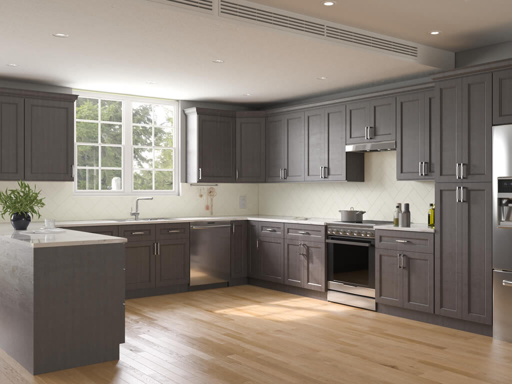
Gray Cabinets: Structured, Modern, Understated

Gray communicates restraint and order. It can look very modern and clean—if the undertone is right.
Where gray goes wrong
Gray can quickly feel flat or cold if:
-
the kitchen has limited natural light
-
the floors are cool-toned
-
the lighting temperature is too blue
How to make gray feel elevated
-
Add warmth with wood accents (shelves, stools, floors)
-
Choose warm gray or “greige” leaning versions
-
Use layered lighting (ceiling + under-cabinet + pendants)
Best for: modern-transitional kitchens that want a quieter, tailored look.
Blue Cabinets: Confident, Calm, Classic
Blue cabinets communicate confidence and calm. Deep blues (navy, charcoal blue) read as sophisticated and “designed,” especially when paired with lighter counters.
Two smart ways to use blue
-
Blue island, neutral perimeter: gives character without overpowering the room.
-
Blue lowers, light uppers: adds depth while keeping the kitchen bright.
Pairing tips
-
Light quartz counters for contrast
-
Brass hardware for warmth, or matte black for a sharper look
-
Simple backsplash patterns so the color can lead
Best for: open layouts, larger kitchens, and homeowners who want color without chaos.
Green Cabinets: Grounded, Natural, Collected
Green communicates grounded confidence and connection to nature. It’s a color that feels fresh, but also surprisingly timeless when chosen well.
Which greens feel the most “forever”
-
Sage: soft, airy, calm
-
Olive: warm, earthy, design-forward
-
Forest: rich, dramatic, classic-luxury
Pairing tips
-
Creamy whites on walls and backsplashes
-
Natural wood accents to keep it organic
-
Brass or aged bronze hardware for warmth
Best for: homeowners who want warmth and personality without a loud trend.
Black and Charcoal Cabinets: Bold, Architectural, High-Contrast
Black and charcoal communicate boldness and intention. They create an architectural look that feels premium—when the kitchen has enough light and contrast.
How to keep dark cabinets from feeling heavy
-
Use light countertops and backsplashes
-
Add reflective elements (glass pendants, polished hardware)
-
Prioritize under-cabinet lighting
Dark cabinets also show dust and fingerprints more than lighter finishes, so they work best for people who don’t mind a little extra upkeep.
Best for: modern kitchens, statement islands, and high-contrast design lovers.
Natural Wood Cabinets: Warm, Authentic, Enduring
Wood communicates warmth, honesty, and longevity. In many American homes, wood tones create a kitchen that feels “real” and lived-in—in the best way.
Why wood is having a lasting moment
Wood softens modern spaces. It balances stone and metal. It also ages gracefully because small marks and patina don’t feel like failure—they feel natural.
Pairing tips
-
Keep counters simple so the wood can shine
-
Choose hardware that matches the wood’s warmth (brass, bronze, black)
-
Use a backsplash that complements, not competes
Best for: transitional kitchens, warm modern spaces, and homeowners who want timeless character.
Color Strategy That Works in Almost Any Kitchen
You don’t need a dramatic palette to get a designer result. You need a strategy.
Match the color to the light
-
Low natural light: choose warmer, lighter colors
-
Bright kitchens: you can go darker with confidence
Use contrast intentionally
A kitchen usually looks best when it has a clear contrast plan:
-
light cabinets + darker counters, or
-
dark cabinets + light counters, or
-
a two-tone approach with a defined focal point
Respect your fixed finishes
Before you pick cabinet color, audit what you’re not changing:
-
flooring undertone
-
countertop temperature (warm vs cool)
-
wall color direction
-
hardware finish
When undertones agree, the kitchen feels calm and expensive.
Two-Tone Cabinets: What They Say About Your Space
Two-tone designs communicate thoughtfulness and balance. They’re an easy way to add depth without clutter.
The most reliable two-tone setups
-
White uppers + deep-color lowers
-
Neutral perimeter + statement island
-
Wood lowers + light uppers (warm modern)
Two-tone works especially well in open-concept homes because it helps define the kitchen without walls.
Common Mistakes to Avoid
Choosing color before layout and lighting
A gorgeous color won’t fix a kitchen that feels dim or awkward. Plan function and lighting first.
Ignoring undertones
A “simple” white can look pink next to one counter and gray next to another. Always compare samples against your real surfaces.
Overloading statement elements
If cabinets are bold, keep backsplash quieter. If counters are dramatic, keep cabinets simpler. Balance is the difference between designer and busy.
Quick “Pick the Right Color” Checklist
-
What is your kitchen’s natural light like (morning and evening)?
-
Are your floors warm-toned or cool-toned?
-
Do you want the space to feel brighter or cozier?
-
Do you prefer calm timelessness or bold personality?
-
Are you okay with extra cleaning (dark colors) or do you want forgiving finishes?
Answer those honestly, and the right color direction becomes obvious.
Final Thoughts
Kitchen cabinet colors say a lot about your space because cabinets are the largest visual surface in the room. White communicates brightness and clarity. Greige and taupe communicate comfort and timeless restraint. Gray communicates modern structure. Blue and green communicate calm confidence. Black communicates bold design intention. Wood communicates warmth and authenticity.
At House of cabinet, the goal is always to help you land on a choice that looks refined today and still feels right years from now—because the best kitchens aren’t built on trends. They’re built on smart, lasting decisions.
Categories
Recent Posts
- Forevermark vs Fabuwood Cabinetry: Which One Is Better for Your Kitchen Remodel in the USA?
- 2025 Kitchen Cabinet Trends & Why Black Base Cabinets Are Taking Over
- Affordable Multi Unit Cabinets – Cost Efficient Property Renovations
- Kitchen Cabinet Frame – Structure and Support
- IKEA Kitchen Cabinets & Kitchen Planner – The Complete Guide for Your Next Remodel